Two American aircraft carriers are steaming toward the Persian Gulf. President Donald Trump has threatened limited military strikes against Iran. Nuclear talks in Switzerland collapsed last week without a breakthrough. Iran’s president has vowed not to fold under U.S. pressure.
Despite these, a data-driven forecast of where violent deaths are most likely between June 2025 and June 2026 shows Iran at relatively low risk compared to the real danger zone, Africa’s Sahel region.
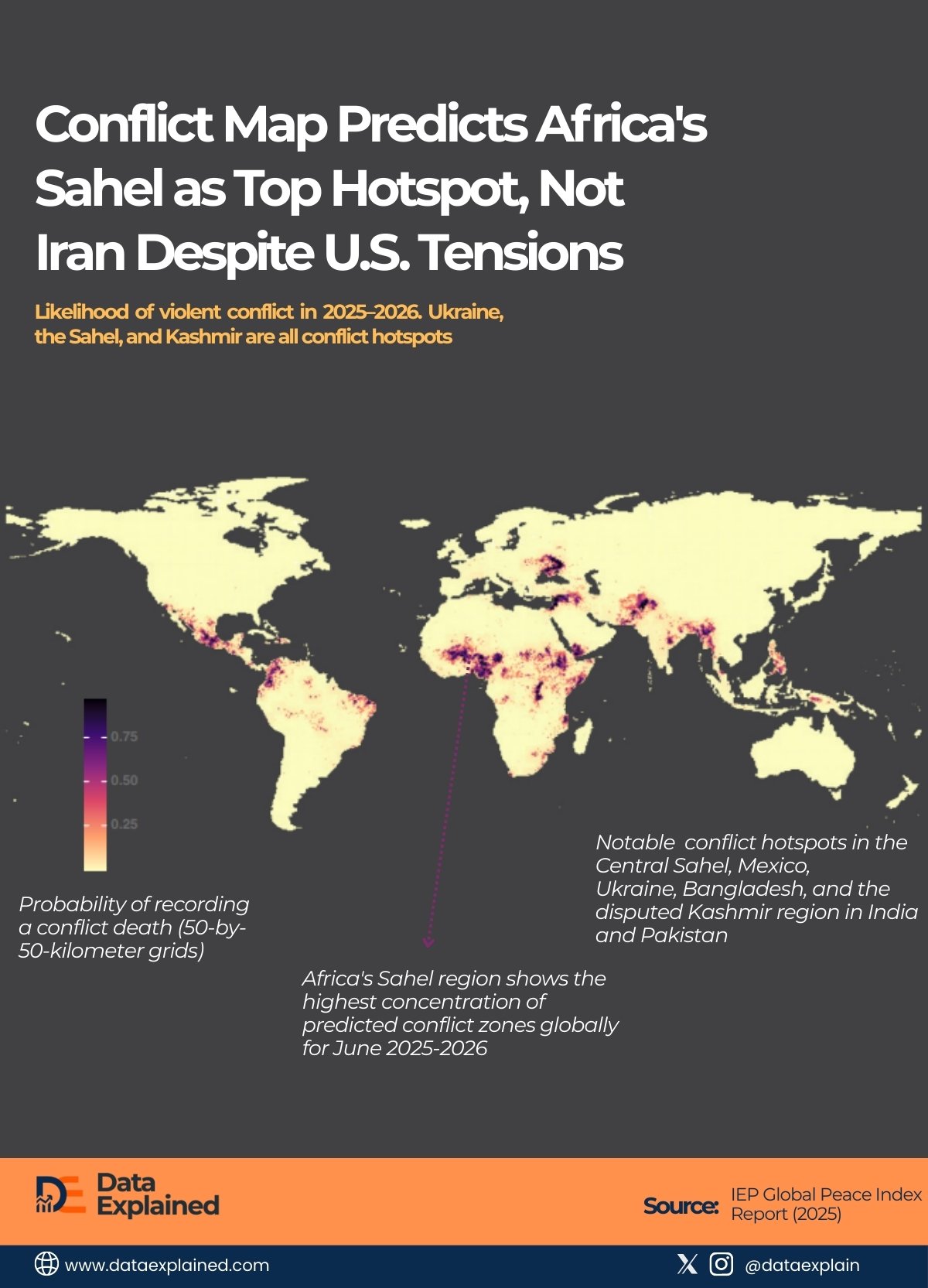
As shown in the visualization above, the region has the densest concentration of conflict hotspots on Earth.
TL;DR
- Iran displays relatively low conflict probability on the predictive map despite failed nuclear talks
- Africa’s Sahel region shows the highest concentration of predicted conflict zones globally for June 2025-2026
- The map uses 50x50km grids to forecast violence at neighborhood-level precision. Global conflict is fragmenting into dozens of localized wars rather than one or two major theaters.
The map is from the Institute for Economics and Peace (IEP) and uses 50-by-50-kilometer grids.
It suggests analysts believe U.S.-Iran tensions will remain high but sub-lethal, while violence across the Sahel from Senegal to Somalia will intensify beyond even Ukraine’s war.
A different kind of war zone
On the map:
- Purple represents areas with a 75% or higher probability of recording a conflict death.
- Pink shows roughly 50% probability.
- Pale yellow indicates lower risk.
The Sahel region lights up in deep purple and bright pink across countries including Mali, Burkina Faso, Niger, Chad, Nigeria, and Somalia.
The concentration of high-risk zones is unmatched anywhere else on the planet (denser than Ukraine’s active war zone, more extensive than Syria or Yemen, and far more intense than anything the model predicts for Iran).
“Ukraine, the Sahel, and Kashmir are all conflict hotspots,” the report notes.
But the map shows that the Sahel’s danger level exceeds those of other regions by a significant margin.
Though this isn’t tracking current violence. It is forecasting where people will die over the next 12 months based on historical patterns, political instability, economic pressures, ethnic tensions, and governance failures.
The model is essentially predicting the future at neighborhood-level precision.
And it says Africa’s Sahel will be deadlier than the geopolitical flashpoints dominating news coverage.
Why the Sahel is exploding
The Sahel has been deteriorating for years, but the pace is accelerating.
- Multiple jihadist insurgencies operate across the region, including groups affiliated with both al-Qaeda and the Islamic State.
- Governments in Mali, Burkina Faso, and Niger have collapsed or face military coups.
- Climate change is driving competition over shrinking farmland and water resources.
- Ethnic militias battle for control.
Yet Western media coverage remains minimal because the conflicts lack the geopolitical drama of great power competition.
There are no nuclear standoffs, no threats to global oil supplies, no involvement of American troops in combat roles.
The Sahel appears poised to experience more violent deaths over the next year than Ukraine, the Middle East, or South Asia. But it receives a fraction of the attention those regions command.
The human toll is already staggering.
Burkina Faso alone has seen over 2 million people displaced by violence.
Mali’s government controls only parts of its territory. Somalia’s government battles al-Shabab militants who regularly carry out deadly attacks. Niger faces both jihadist threats and the aftermath of a military coup.
The conflict prediction map suggests all of this will intensify, not improve, over the coming year.
What the map says about Iran
Meanwhile, Iran (the focus of intense diplomatic and military pressure) shows relatively low conflict probability on the map.
This doesn’t mean tensions aren’t real or dangerous. It means the predictive model doesn’t expect Trump’s strike threats and carrier deployments to translate into sustained lethal conflict on Iranian soil.
There are several possible explanations.
Iran and the United States have engaged in tit-for-tat confrontations for decades without full-scale war.
Both sides understand the costs of direct conflict.
Iran’s nuclear program creates deterrence. And limited strikes, if they happen, might not meet the model’s threshold for sustained violence.
The model also struggles with maritime zones. If conflict erupts in the Strait of Hormuz (a vital oil shipping route), it wouldn’t appear clearly on a land-based grid system.
When predictions meet reality
Forecasting violence is imperfect. These models can’t predict sudden events, such as a presidential decision to launch airstrikes or an unexpected breakthrough in negotiations.
They identify structural risk (the underlying conditions that make violence likely), rather than specific trigger events.
But they often prove remarkably accurate.
Areas that glowed red in previous conflict prediction maps frequently experienced the violence researchers expected.
That makes this map a warning.
If the Institute for Economics and Peace is correct, Africa’s Sahel region faces a catastrophic year ahead.
ELI5
And while diplomats shuttle between Oman and Switzerland, trying to prevent a war with Iran that the data suggests may not materialize as sustained lethal conflict, the deadliest zone of 2025-26 will continue burning largely unnoticed.
The map shows where the world should be looking. The question is whether anyone will pay attention before the purple zones turn into confirmed death tolls.
Sources:
EPI Global Peace Index Report | UCHR | Aljazeera Military Buildup Tracker