
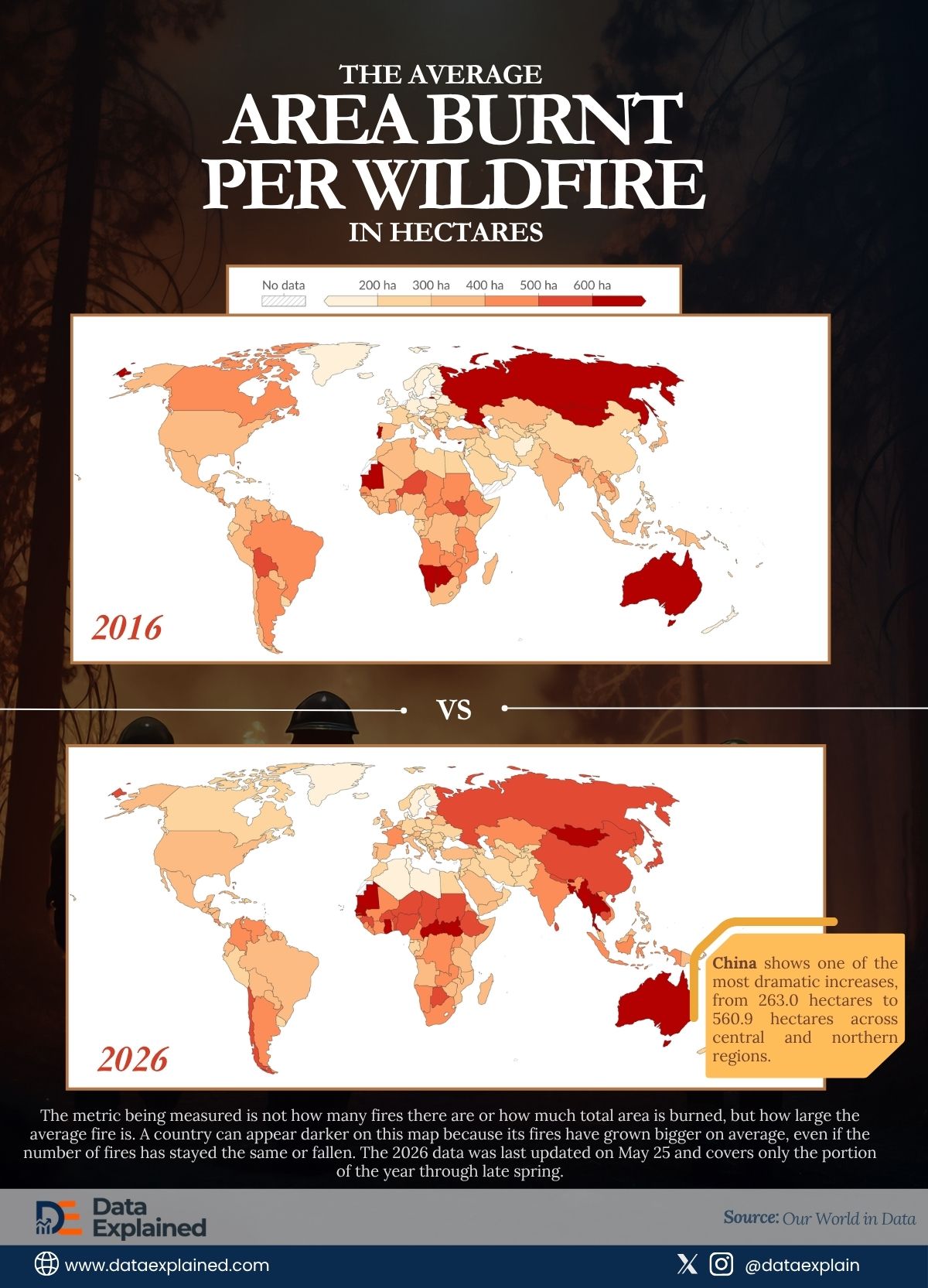
Today’s visualization shows the average area burnt per wildfire in hectares by country. It compares 2016 and 2026, averaging around 200-600 hectares and above.
The data comes from The Global Wildfire Information System, accessed via Our World in Data.
The metric being measured is not how many fires there are or how much total area is burned, but how large the average fire is.
A country can appear darker on this map because its fires have grown bigger on average, even if the number of fires has stayed the same or fallen.
Bigger fires are harder to suppress, burn longer, require more resources to contain, and cause more sustained damage to infrastructure.
Average fire size is a measure of both fire intensity and fire management difficulty.
TL;DR
- China shows one of the most dramatic increases in single-country wildfire area in the 10-year comparison, rising from 263.0 hectares to 560.9 hectares across central and northern regions.
- No region in the two-map comparison has demonstrably lightened.
| wdt_ID | wdt_created_by | wdt_created_at | wdt_last_edited_by | wdt_last_edited_at | Country | Annual Area Burnt per Wildfire (2016) | Annual Area Burnt per Wildfire (2026) |
|---|---|---|---|---|---|---|---|
| 1 | emmanuel-ashemiriogwa | 01/06/2026 11:23 AM | emmanuel-ashemiriogwa | 01/06/2026 11:23 AM | Afghanistan | 186.2 | 244.3 |
| 2 | emmanuel-ashemiriogwa | 01/06/2026 11:23 AM | emmanuel-ashemiriogwa | 01/06/2026 11:23 AM | Albania | 299.7 | 226.0 |
| 3 | emmanuel-ashemiriogwa | 01/06/2026 11:23 AM | emmanuel-ashemiriogwa | 01/06/2026 11:23 AM | Algeria | 303.6 | 187.7 |
| 4 | emmanuel-ashemiriogwa | 01/06/2026 11:23 AM | emmanuel-ashemiriogwa | 01/06/2026 11:23 AM | Angola | 427.7 | 371.0 |
| 5 | emmanuel-ashemiriogwa | 01/06/2026 11:23 AM | emmanuel-ashemiriogwa | 01/06/2026 11:23 AM | Antigua and Barbuda | 150.0 | 147.0 |
| 6 | emmanuel-ashemiriogwa | 01/06/2026 11:23 AM | emmanuel-ashemiriogwa | 01/06/2026 11:23 AM | Argentina | 444.2 | 420.2 |
| 7 | emmanuel-ashemiriogwa | 01/06/2026 11:23 AM | emmanuel-ashemiriogwa | 01/06/2026 11:23 AM | Armenia | 265.9 | 224.5 |
| 8 | emmanuel-ashemiriogwa | 01/06/2026 11:23 AM | emmanuel-ashemiriogwa | 01/06/2026 11:23 AM | Australia | 731.1 | 817.6 |
| 9 | emmanuel-ashemiriogwa | 01/06/2026 11:23 AM | emmanuel-ashemiriogwa | 01/06/2026 11:23 AM | Austria | 0.0 | 340.5 |
| 10 | emmanuel-ashemiriogwa | 01/06/2026 11:23 AM | emmanuel-ashemiriogwa | 01/06/2026 11:23 AM | Azerbaijan | 327.5 | 259.9 |
NOTE: The 2026 data is incomplete, last updated May 25, and covers only the portion of the year through late spring. It is already showing more red than 2016 did at full year.
China’s Shift
The most visually striking national change between the two maps is China.
In 2016, China appeared in light-to-moderate colors across most of its landmass. In 2026, significant portions, particularly across central and northern regions, have darkened considerably toward the higher end of the scale. China is the world’s most critical manufacturing and supply chain hub.
It is also, according to this decade of data, one of the countries experiencing the most significant increase in wildfire intensity.
That combination has not yet entered the mainstream conversation about global fire risk in the way that Australia, California, or Siberia have.
Russia and Australia: The Consistent Extremes
Russia appears at the deepest red end of the scale in both maps, the most persistently extreme wildfire-intensity country in the dataset.
The average area burnt per wildfire in Russia as of 2016 was 630.3 hectares. The number slowed down to 575.9 ten years after.
Russia’s Siberian boreal forest contains more stored carbon than any other terrestrial ecosystem, and fires in that region release that carbon while also thawing permafrost and producing the dry surface conditions that fuel further fires.
Russia’s fire problem is a feedback loop: warming drives fires, fires drive more warming.
The 2026 map shows that the loop is continuing, with the extreme coloring appearing to have widened slightly in geographic distribution compared to 2016.
Australia appears in deep red on both maps, with no visible improvement.
The country experienced its worst-ever wildfire season in 2019-2020 (the Black Summer, which burned approximately 18.6 million hectares) within the decade spanned by these two maps.
The 2026 map offers no indication that Australia’s average fire intensity has improved since then.
The Bigger Picture
Of all the observations the two-map comparison produces, the most important is that no zone in the 2026 map is clearly lighter than it was in 2016.
The global wildfire intensity trend is moving in one direction.
This is the finding that the Quad Foreign Ministers (gathering in Delhi, with Australia’s Penny Wong, US Secretary of State Marco Rubio, and Japan’s foreign minister convening to discuss energy, supply chains, and Indo-Pacific security) are operating against.
Their agenda’s language of a world on fire has a dataset that makes the description literal.
The energy and supply chain infrastructure they are meeting to protect sits in a geography that, by the measure captured by the GWIS data, is becoming more fire-intense every decade.
The Year isn’t Over…
The 2026 data is partial.
The Northern Hemisphere’s peak fire season (July through September for Russia, Canada, and Central Asia) has not yet been recorded in the dataset as of the May 25 update.
When the full-year data arrives, the map will add the months that historically produce the largest fires in the world’s most fire-intense northern regions.
ELI5
Scientists track the average size of wildfires each year. When you compare the map from 2016 with the map from 2026, almost everywhere on Earth has gotten darker, meaning fires are burning bigger areas than they used to. No part of the world has improved. China has changed the most dramatically. Russia and Australia remain the worst. The data says wildfires are getting worse worldwide, and 2026’s numbers aren’t even complete yet.
Source:
Global Wildfire Information System (GWIS), 2026, accessed via Our World in Data